So guys, ever wondered why you clicked “Add to Cart” on that skincare product you didn’t plan to buy? Or why certain websites just feel like you can trust them with your money even before reading a single review?
Well, my friend, the answer might just be colour. Yep, not the persuasive copy and not the product photos (well, okay, a little bit of that too) but that splash of blue, pop of red or calm green might have done the heavy lifting.
Before I continue, welcome to another blog post from Creative Chaos where we talk about everything marketing and branding. Today, we are going to be talking about how certain colours influence the buying process and how we can take advantage of it.
See, colour psychology isn’t just for interior designers and makeup artists. It’s a strategic tool that top brands use to influence our emotions, decisions and ultimately, our wallets.
If you’re a business owner, brand strategist, or creative trying to increase sales, engagement or brand trust, understanding the psychology of colour might just be your not-so-secret weapon.
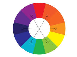
So let’s dive into the rainbow of results, shall we?
1. Red: The Colour of Urgency and Appetite
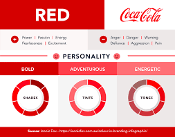
Ah yes, the “buy now or regret forever” colour.
Red is known to trigger urgency, excitement and appetite. That’s why brands like Coca-Cola, Netflix, KFC and YouTube wear it proudly. It stimulates energy, increases heart rate and pushes users to act now.
Best For:
Clearance sales
Fast food brands
Call-to-action buttons
Tip: Use red sparingly. Too much and your site will start to look like an emergency room.
2. Blue: The Colour of Trust and Logic
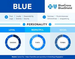
There’s a reason Facebook, PayPal, LinkedIn, and Dell are dressed in shades of blue. That is because it screams trust, dependability and professionalism.
It also reduces appetite so you had better don’t use it for your food brand unless you want to confuse your buyers.
It is best For:
Finance & tech brands
Healthcare
B2B service businesses
Tip: Lighter blues feel calming and refreshing while darker blues equals authority and confidence.
3. Yellow: The Colour of Optimism and Attention
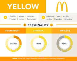
Yellow is like the friend who lights up the room and makes you believe you can take on the world.
IKEA, McDonald’s, Snapcha and Post-it know how to use this cheerful hue to catch the eye and spark optimism.
Best For:
Youth-centered brands
Travel and lifestyle products
Pop-up announcements or flash sales
Tip: It can be overwhelming in large doses. Use it to highlight and not hijack the design.
4. Green: The Colour of Growth and Peace
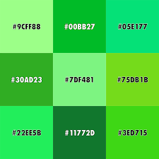
Green makes us feel safe, soothed and in tune with nature. That’s why it works for brands like Whole Foods, Spotify and Animal Planet. It also symbolizes wealth and growth and so it is perfect for anything from eco-friendly products to fintech.
Best For:
Organic brands
Finance apps
Wellness and skincare
Tip: Darker greens communicate luxury and affluence while lighter greens feel fresh and natural.
5. Black: The Colour of Sophistication and Power
Want to look classy, bold and luxurious? Black is your go-to.
Think Chanel, Nike, Apple, and Adidas. They all use black to signal elegance and strength.
Best For:
Luxury fashion
High-end gadgets
Minimalist branding
Tip: Pair it with gold, white or beige for a more high-end look.
6. Orange: The Colour of Enthusiasm and Action
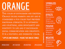
Orange is the extrovert of the colour family. This is because it is fun, bold and slightly mischievous. It’s not as aggressive as red but still motivates action and confidence.
Fanta, Amazon, Nickelodeon and SoundCloud use it to tap into energy and youthfulness.
Best For:
E-commerce
Fitness and entertainment brands
Brands targeting Gen Z or Millennials
Tip: The color is great for CTA buttons especially the “Get Started” or “Free Trial” ones.
7. Purple: The Colour of Creativity and Royalty
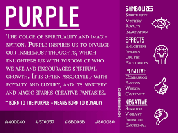
From spiritual wellness to artistic expression, purple is often used to signal luxury, imagination and wisdom.
Yahoo, Cadbury, Hallmark, and Twitch use purple to stand out and express a unique identity.
Best For:
Creative businesses
Beauty brands
Premium services
Tip: A great colour for self-care and coaching brands that want to feel both soft and special.
8. White: The Colour of Simplicity and Space

White isn’t just the background. It’s the breathing space that makes your brand feel clean, minimalist and modern.
Think of Apple’s iconic packaging or Google’s homepage. It is clean, clear and focused. It works magic when used strategally.
Best For:
Tech startups
Modern service brands
Wellness and skincare
Tip: Use it as your base to let other colours shine.
Final Thoughts: Colour Isn’t Just Pretty, It’s Profitable
The colours you use can literally impact whether someone buys or bounces.
You don’t need to be a design genius to get this right, you just need to think about the psychology behind each color and how it supports your brand message.
If you’re building a brand, launching a website or designing product packaging, think beyond what “looks nice” and start choosing what feels right.
Let’s Talk:
What colours are you using in your brand?
Are they turning browsers into buyers or sending them
running? Drop your colour palette in the comment section.
And if you’re stuck, confused, or tired of guessing your brand strategy, Creating Chaos is always already to help you out.